P3 3-4/2021 en
Grammy Winner Jonathan Barnbrook
“Try and Change the World!”
Paper & People
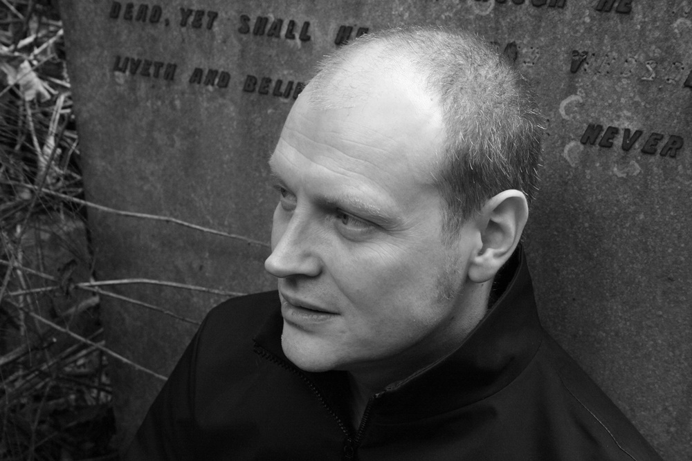
Jonathan Barnbrook: “Make the first experience working with you enjoyable and people will come back.”
Sometimes chances come out of nowhere. You only have to take them. I admit I was pretty excited when my paths happened to cross with the ones of Jonathan Barnbrook - the man who was responsible for the artwork on David Bowie's last four albums, amongst other things. One size too big? No! Mr Barnbrook turned out to be a modest English gentleman - albeit with a Grammy on the bookshelf.
Jonathan Barnbrook: “Make the first experience working with you enjoyable and people will come back.”
Let's start at the beginning: Your Wikipedia entry describes you as a graphic designer, filmmaker and typographer. What brought you into this industry and how was your career?
Jonathan Barnbrook: The way into graphic design, in which I work as film maker and typographer was through record covers. It was the first ‘art’ I came into contact with and I used to copy them and the band logos meticulously. I had always loved art and I sat down with my art teacher at school and he asked me what I was going to do when I left. I was planning some kind of technical drawing job and he said ’Take a look at graphic design, this is what you are’. And he told me about what designers do and the different possible things to study. So really I have him to thank for going on this path. I was at a fairly tough school, so not everybody was so lucky in their path when they left school.
In the course of your career, the technical requirements for designers have changed significantly. Do you prefer to work with paper on design projects or do you prefer a digital approach? Can you still choose that at all?
J.B.: Yes, the introduction of the computer has been one of the most fundamental changes. I feel lucky that I learnt how to draw and design the traditional way, although I dont miss doing artwork at all, it was SO tedious, spacing type or putting it on a curve by hand or the things you would have to do if you made a mistake. I remember when I sat down at a computer at my art college in 1985, I just couldn’t believe how much you could do with it. It was very primitive by today’s standards but extremely liberating.
Having said that, I sometimes have to draw stuff by hand to work them out directly, it can help the form of something by simply using the sweep or stroke of a pencil.
Does digital work seem more impersonal to you?
J.B.: No, no method seems impersonal, it’s the thinking that goes into using the technology or tool that is important. Digital is not just a replication of traditional crafts, it brings a new way of thinking and approaching. To use a parallel: Electronic music can be as passionate and emotional as acoustic music – and it is also different and has its own character - and it is the same in design with the methods you use.
How do you start a new project? Can you explain your way of working to our readers, perhaps with a special focus on the differences between analog and digital approaches?
J.B.: The analogue part is the ‘thinking', which is usually quite fuzzy, the computer is the thing to bring that into focus. That is one of the things the computer does best – but it is also its worst feature. The idea or solution takes a while to germinate in your mind, its kind of nebulous. You draw it on the computer and it is there in naked black and white – and usually looks terrible. What the computer is doing: enabling you to refine it. That simply was very difficult before computers, you had one shot at specifying the type and you would hope it would come back ok. With the computer it's the hours of refining that help make the job what you want it to be. Having said that, I dont want to accent too much about the computer. It is the mind that I am employed for which hopefully brings the right creativity and then how that mind uses the computer to interpret it.
You are best known for album cover artwork. Which covers and designers influenced or encouraged you to try something like this yourself when you were young? Roger Dean, Hypgnosis - or maybe H.R. Giger, who did the artwork for ELP’s Brain Salad Surgery?
J.B.: Hmmm … If you don’t mind me saying this, the record covers you are talking about are a generation slightly before me. Hypgnosis yes, but it was mainly Neville Brody, Peter Saville, Malcolm Garrett and Vaughan Oliver. So less illustration and more designers who used the printing process and materials to create something which matched the beauty of the music in a very modern way. I also noticed that all of these at some point either drew or had drawn custom type – this for me is quite fundamental in being able to create the world of music in a visual form. A custom typeface is like a specific visual voice of the music, so I feel it is quite important - so I draw typefaces and also create things specifically for music projects I work on.
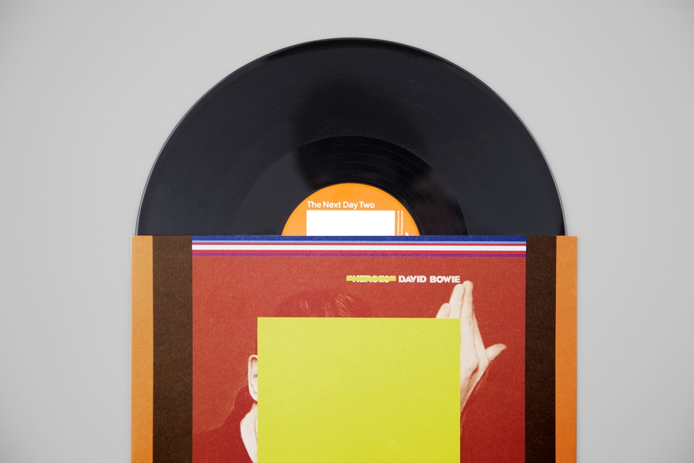
You designed the covers of David Bowie's last four studio albums: Heathen, Reality, The Next Day and Blackstar. How did this collaboration come about?
J.B.: I worked on a book for his wife, the former model Iman. He went around London talking to different design groups and chose me. I put my heart and soul into it because as well as wanting to do a good job I wanted to open up future possible options of working with Bowie. The best way to get work is repeat business. Make the first experience working with you enjoyable, positive and creative and people will come back. This is why I always say you need to like people to be a graphic designer. As the interaction is really important and if you have a tantrum, are not pleasant then they won’t come back no matter how important you think.
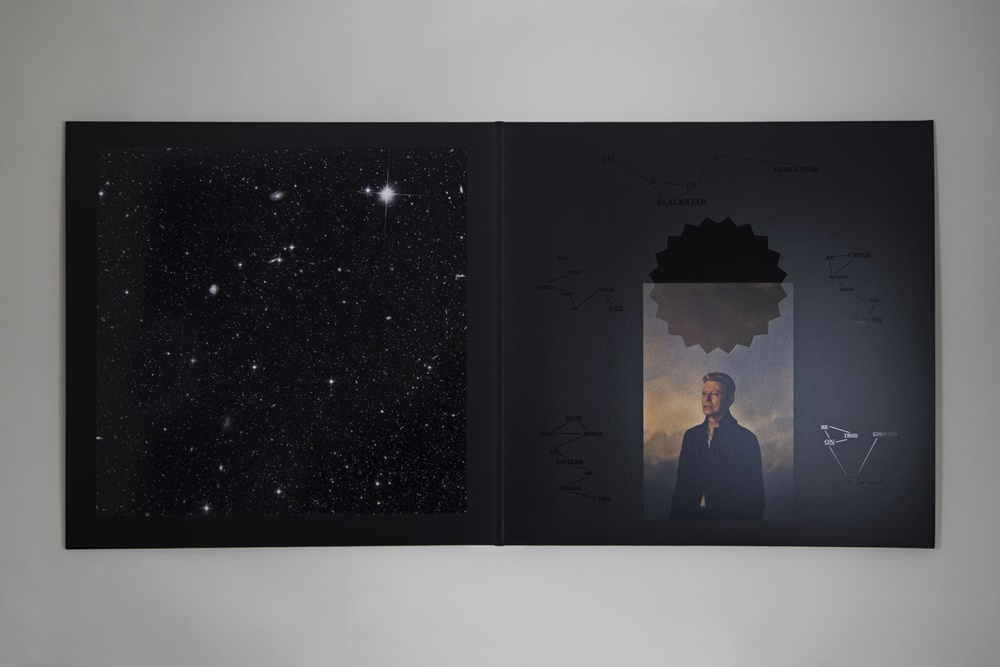
You won a Grammy for your work on Blackstar and were nominated for The Next Day. That sounds like a decisive experience. Did the phone ring every minute after that? Does something like that raise the bar or does it even change the way you work?
J.B.: I tend not to think about it too much, most important is to do good work. I am not really into ‘awards’ and hardly ever enter them. So it hasn’t made one bit of difference. Having said that, this one did mean a lot to me because it wasn't something from just inside my profession but from the wider world. The award was good for visibility but also a few people said to me that they wouldnt consider employing me because I would now be too expensive (ha) – which when you look at some of the smaller artists I have worked for is obviously not the case – if a job is interesting then there is flexibility with a budget. I think the most interesting jobs throughout the history of graphic design have been done with restrictions of technology or budget. It's being able to use these restrictions in a positive way that is the mark of a good designer.
Relationship to creativity is a complex thing. I am not necessarily happy when I finish a piece of work. There is always that trying to attain something better inside you. Its only about 10 years later that I can have enough distance to see if a piece of work is good or not. So day to day, creativity is still a struggle – as it should be if you want to be good.
You currently live in London. But Grammy Award also sounds like Hollywood, villa and jacuzzi ...
J.B.: Its on my bookshelf in London. Er … nothing more than that. I do remember the weirdest part of the ceremony was that there was a crowd of seated people I walked past, and they clap your name and cheer as it is announced – I went up to them and asked why they were doing that when they had no idea who I was, and one guy said ‘this is Los Angeles, this is my job and this is what I am paid to do’.
If you're designing a cover, do you want to hear the music before you take the job?
J.B.: I dont need to hear the music but I do need to connect with the artist in some way, otherwise I worry I won’t put my heart into it. So before we get to the point of agreeing to do a specific album I have to know the artist and understand something about their creativity. So I do tend to work with artists whose music I understand and like as it makes a big difference to your energy and enthusiasm.
You are known for using design to give answers to political events. Do you think people are listening to such statements nowadays, or is it just a method to let the frustration out?
J.B.: The answer to this is ‘Yes’ - to both. I think there is a natural human reaction to want to express frustration so they are made for this purpose, but also if you look through the history of protest you will see that graphic design has been the main use of carrying messages – placards, posters, leaflets, now digital. So it is a very effective force in politics.
Talking about politics, was it – in your opinion – the right decision to lead Great Britain out of the EU? Or did Boris Johnson do damage to the country just to stage himself?
J.B.: I am a committed European and still remain so, I feel very disconnected with Boris Johnson, although because most politicians don't appear to have much personality I can see why people are into him. I don't understand the British people, it seems like they are masochists. We have the royal family – which guarantees that the class system will be with us – that support all of the private school educated, rich men who simply don't understand what it means to have no money. This is all supported by the poorer people (I come from a poor working class family). So they are willingly consenting to being repressed. At some point I may leave the UK and live somewhere in Europe.
Back to design and typography: Is designing your own fonts something that can still pay off these days? There are thousands of fonts on the web - how can you make a difference?
J.B.: It's a major investment making a font. So I tend to do it rarely as the time taken to produce one that can be used for text, has all of the characters for different languages – all spaced and drawn correctly – can take a very long time. The only time that recently I have done it is as part of a branding identity or actually for a Bowie album – I drew a new font for ’The next day’ because I wanted it to be part of the ’newness’ of releasing that.
What advice would you give to a newcomer to the industry?
J.B.: I haven’t a clue! ‘Be stupid, don’t think too much, try and change the world’ is probably as good as anything as you will take more risks in doing the work you really want to do. You only have one life.
Final question: family, hobbies, job, vocation - what are your priorities and what can we expect from you next?
J.B.: I am 54, so honestly I can see the end of my life coming. I am still motivated to do good work, but I would like it to be more on my terms. Being a graphic designer is tough, people see you as a ‘service’ rather as an artist - I would hope by now for a little more understanding from people who know what I am doing. Secondly, a little more time to concentrate on my other love which is electronic music. It is the reason I became a graphic designer in the first place with bands like Kraftwerk and seeing their record covers. So space to do that and mix it with design is the ultimate thing. I have just started with the release of the first album by our band Fragile Self – www.fragileself.com.
Jonathan, thanks a lot for the interview!
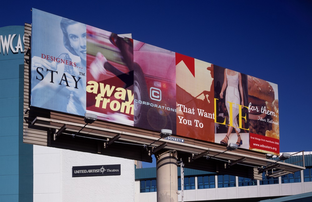
Adbusters: First Things First: Jonathan Barnbrook was one of original signatories of the revised First things First manifesto that was reissued by Adbusters in 2000 and signed by 33 leading visual communicators. The original was written by Ken Garland in 1964. The manifesto called for meaningful design and questions the role of designers in society. Barnbrook designed Issue 37 of Adbusters ‘Design Anarchy’ and completed several other associated works discussing the themes of the manifesto including this billboard. This was put up in Las Vegas to coincide with the AIGA (American Institute of Graphic Arts conference). The billboard states “Designers, stay away from corporations that want you to lie for them” - A quote by Tibor Kalman.
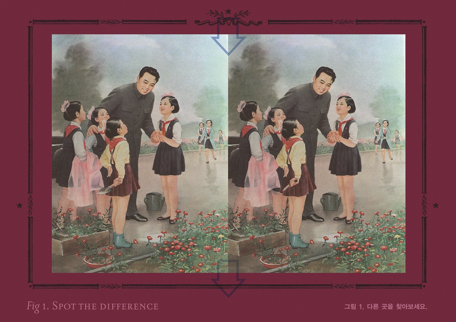
North Korea: Series I – Building the Brand: A project completed for a South Korean ‘Design’ magazine about issues surrounding the dictatorship of North Korea. The work does not just criticise the regime but compares it to our own ideas of freedom in the West. The project also tried to give hope that the power individuals have over dictatorships.
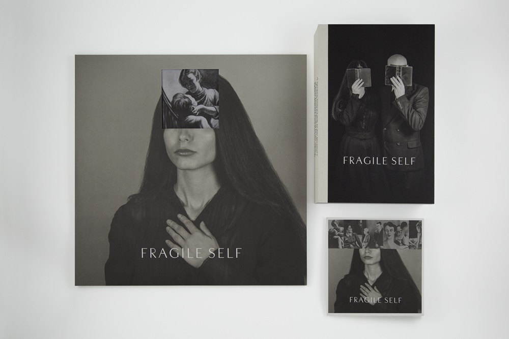
With his band Fragile Self, Barnbrook combines the two things he loves most: Electronic music and design.
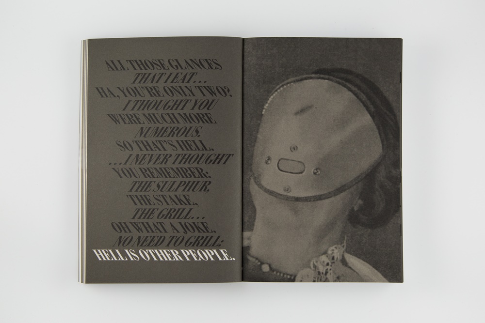
The Fragile Self book: 480 pages of original photography, selected text, original artworks and cutting edge design. This photo was taken from the chapter “Deperson”.
Editor: sbr
Images: Jonathan Barnbrook


