P3 3-4/2023 en
Business Cards
Corporate Culture Captured on Paper
Stationery
The business card - a relic from the analogue era or an object of desire in the sense of Bret Easton Ellis' “American Psycho”? Even in the age of LinkedIn & Co., the business card remains a valuable branding tool. In order for companies to convey the quintessence of their brand effectively in just a few square centimetres, every detail is important when it comes to design and printing. The example of a traditional real estate company shows what a successful result looks like.
Even in the age of LinkedIn & Co., the business card remains a valuable branding tool.
The exchange of business cards is still a sophisticated business ritual in China, the country of origin: get up from your seat, state your name and position, hand over the business card with both hands, bow, accept the other person's card with both hands, study it carefully and put it on the table in front of you. Handing over a business card is about much more than the pragmatic exchange of contact details. Business people in China, Japan or South Korea see the business card as an extension of their identity.
Business cards are also used as a brand communication tool outside of Asia. LinkedIn now has almost 200 million members in the USA, while around ten billion business cards leave the printers in this country alone every year. On the one hand, this can be explained by the fact that both channels have different orientations and pursue different goals. On the other hand, traditional print products enjoy uninterrupted popularity due to the added value they offer - on a practical as well as on an emotional level.
„Bad WiFi is irrelevant for business cards.“
Bernhard Cantzler, Head of Marketing & Business Development Mondi Uncoated Fine Paper
Business card as a carrier of emotions
Bad WiFi is irrelevant for business cards. While social networks, address books from e-mail providers and messenger services depend on network quality, business cards can be exchanged anywhere, anytime and directly. Without login, without cumbersome search and data entry. Enriched with digital elements, business cards bridge the gap between the analog and the digital world.
As a print product, business cards not only carry information, but also emotions that are perceived with all the senses. Hundreds of contacts quickly come together on networking platforms, but a lovingly assembled collection of business cards - possibly supplemented by handwritten notes on individual cards - transports memories and commitment. The haptic experience of the paper surface awakens associations and feelings - and is more firmly anchored in the memory of the recipient. The fact that business cards are so memorable is an invaluable advantage, especially in view of digital oversaturation. Colour, design elements, font, paper surface, finishes - on a standard size of 85 x 55 millimeters, a business card combines countless sensory impressions and thus opportunities for companies to stand out from the crowd with a unique corporate design.
Color and finishing trends for business cards
The world's most expensive business card costs $1,500. These cult objects from the manufacturer Black Astrum are made of high-quality Swiss Hesa glass and set with diamonds. Luckily, companies don't have to be that decadent to make a valuable impression. But neither should they leave the design or material to chance.
Companies have never had so much creative freedom in designing their business cards as with the trends of recent years. Whether strong primary colors and reduced geometric shapes, extravagant color gradients, full-surface colors or monochrome designs: color is visibly gaining importance as a differentiating feature in corporate design.
Bright, vibrant business cards need to be carefully selected with an eye on the industry, company positioning and target audience to balance trend and authenticity. The situation is similar with color gradients, playful retro nostalgia with "handmade" elements and other design trends of recent years: for a coherent appearance to the outside world, they must be in harmony with the character of a company - the corporate identity. In addition, all of these trends place high demands on paper quality and color reproduction in order to really come into their own.
Mondi Uncoated Fine Paper offers its Pergraphica® premium design papers in three shades of white with outstanding color rendering and in 31 soft, rich and dark colors to stage the corporate identity of each company in an impressive way. In addition, Mondi UFP supports companies with their branding through digital offers, such as informative webinars, easy-to-use design templates and ICC profiles for professional color management.
So that the business card not only impresses visually, but also haptically, it is worth investing in a higher paper grammage of at least 300 g/m2 and a high-quality, uncoated paper surface. Not only because of an appealing feel, but also for practical reasons. A business card is touched frequently - the paper surface should repel fingerprints and look like new even after repeated use so that the valuable impression is retained.
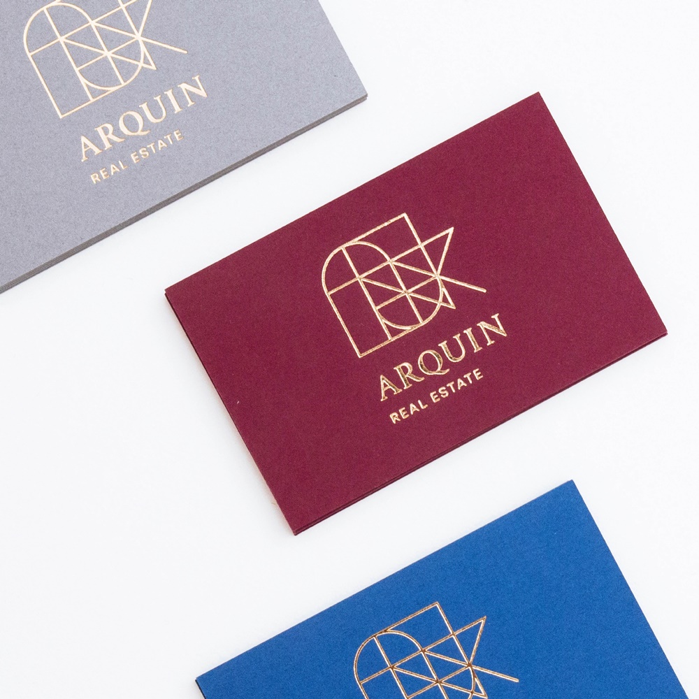
When it comes to finishing, hot foil embossing - whether metallic in gold or silver or transparent - remains a perennial favorite among the business card trends, especially since it literally leaves a shiny impression. The contrast between the high-gloss metallic finish and the naturally matt uncoated paper makes the business cards a real eye-catcher. For that extra recognition value, edge finishes are currently very popular, especially for business cards, in the form of color edges as well as in the form of foil finishes. Basically, any refinement that leads to a sublimity of certain parts of the business card provides an interesting haptic experience and thus helps companies to stand out from the crowd with their business card. The Pergraphica® design papers from Mondi UFP with a grammage of up to 400 g/m2 can be excellently printed and finished on both sides in order to create individual effects.
Paper makes the brand speak
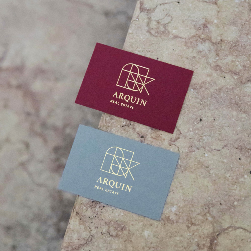
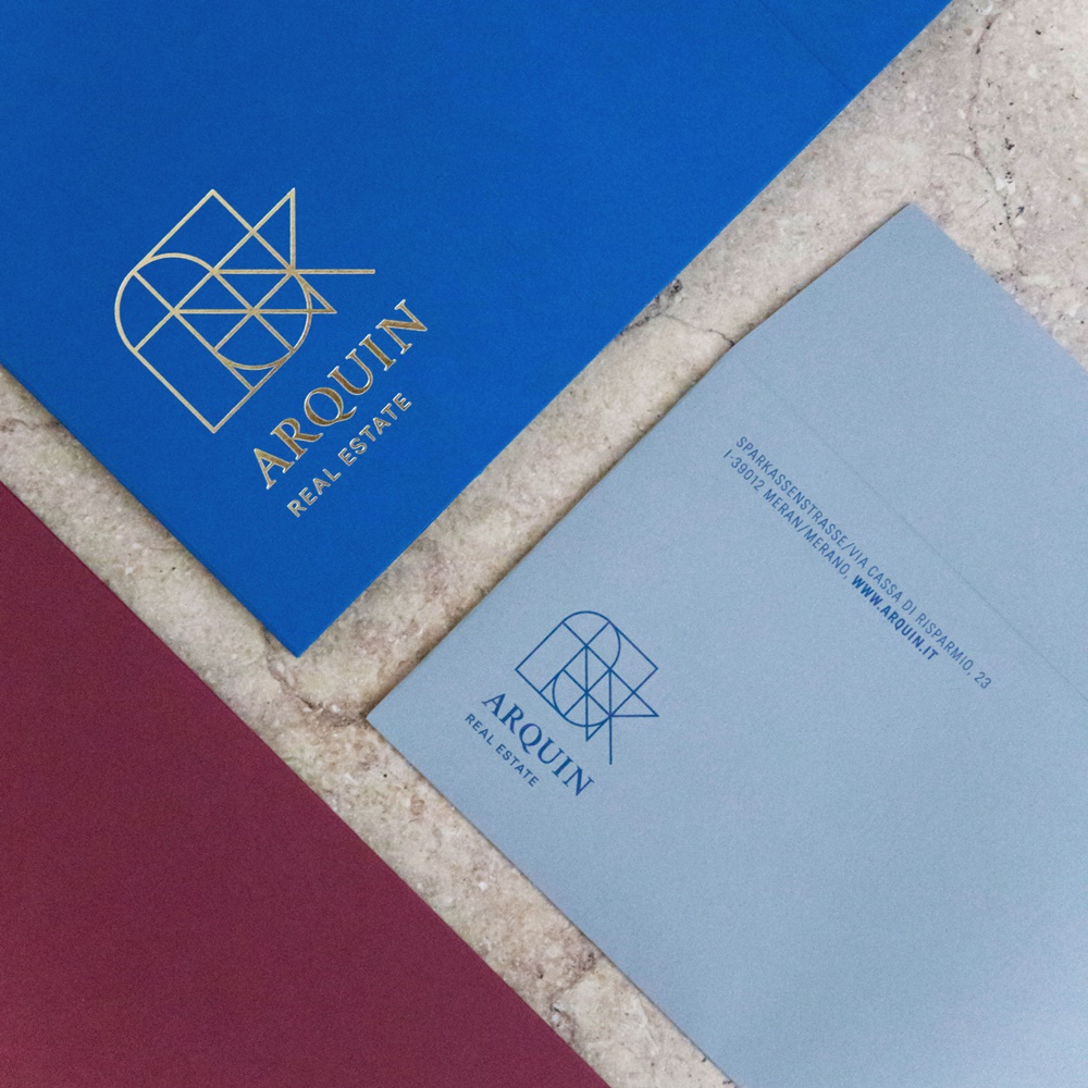
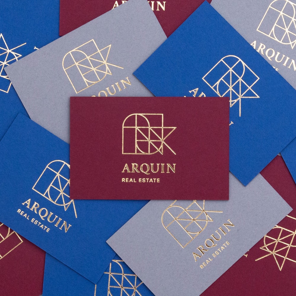
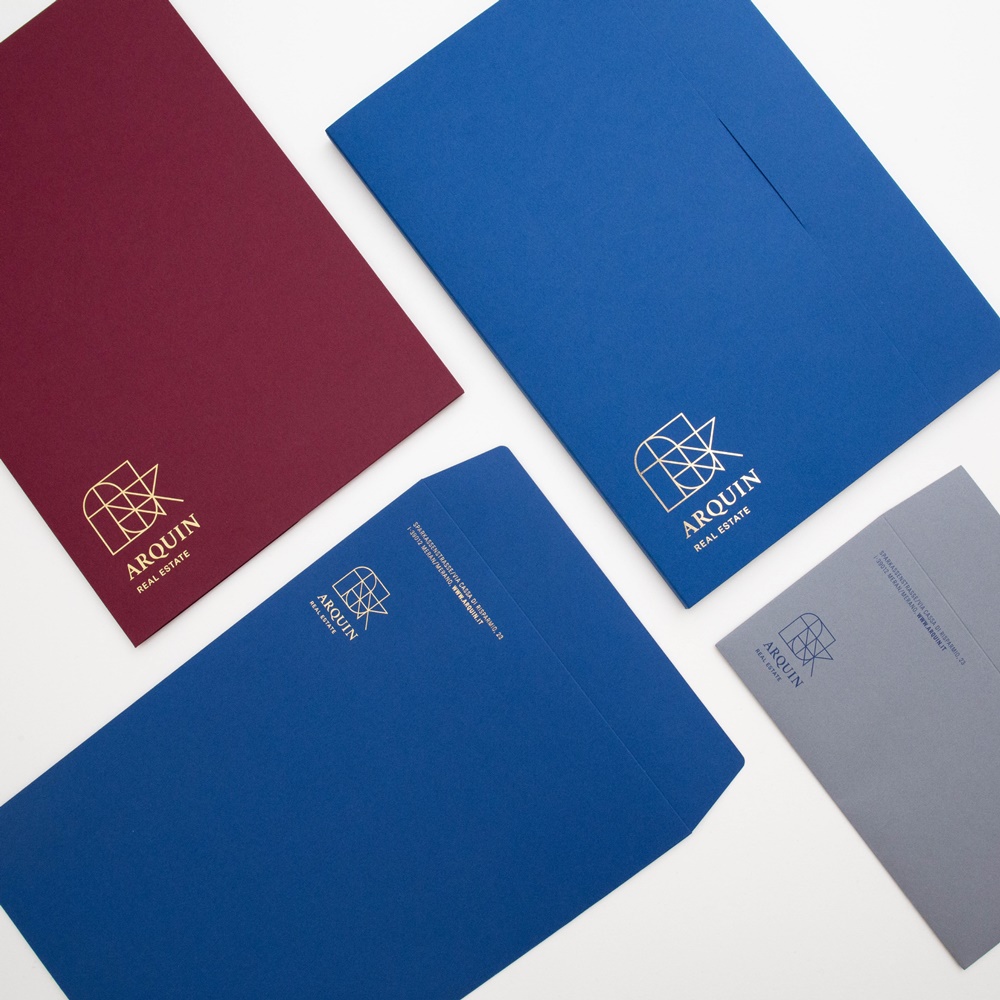
Arquin is an example of how a successful combination of colours, paper quality, design and finishes can strengthen a brand. The traditional real estate company from South Tyrol has developed a new corporate design as part of its 50th anniversary in cooperation with Mondi UFP and the design studio W13 from Bozen. The goal was to make the brand values of self-confidence and elegance visible and tangible at every touchpoint with the public.
The new logo boasts elegant simplicity with subtle lines and the letters of Arquin stylized into geometric shapes. It is embossed onto the business cards with gold-colored hot foil and stands out elegantly against the strong background. Mondi's Pergraphica® Dark & Deep Colors ensure the luxurious appearance of Arquin's business cards. The contrast between the primary colors Mysterious Blue, Noble Red and Stormy Gray and the secondary color yellow reflects the balancing act between tradition and modernity, between seriousness and elegance. With this successful combination of design and matching paper, Arquin's timeless corporate design is well positioned for the decades to come.
Author: Bernhard Cantzler, Head of Marketing & Business Development Mondi Uncoated Fine Paper
Editor: sbr
Images: Design Studio W13


