P3 5-6/2021 en
The Vanguard Collection
The Role of Colour in a Post Pandemic World
Paper & People

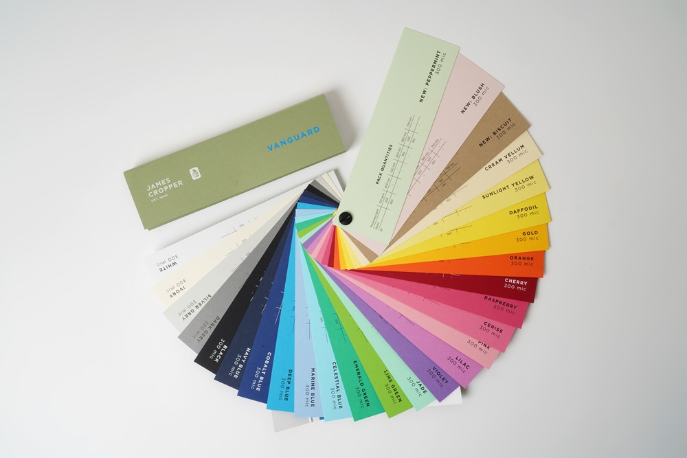
The new Vanguard palette of 28 colours offers customers soft on trend pastels with understated elegance, through to intense bolds and cheerful bright shades.
Having survived fires, The Great Depression, two world wars and now a global pandemic, James Cropper is well versed in adapting to, and surviving, the impact of world events that lie outside of our control. We’ve been doing it for nearly two centuries! With that experience we recognise that in times of crisis, things change in the consumer market, and as a business providing brands with paper and packaging solutions, we need to be across those changes so we can deliver what is in demand. The Coronavirus pandemic has altered consumers’ expectations and desires which is why we’ve invested in refreshing our Vanguard range of papers.
The new Vanguard palette of 28 colours offers customers soft on trend pastels with understated elegance, through to intense bolds and cheerful bright shades.
Ever since a global pandemic was declared the world has lived with uncertainty in everyday life. The way we work, learn, relax and travel are just some examples of how lifestyles have had to be reimagined. Research which we commissioned recently has also revealed how it has even changed the colours we’re drawn to in life.
It’s fair to say that the post pandemic consumer will come with some degree of apprehension and caution when making buying decisions and, as experts in colour, we wanted to explore how this could influence the colours which attract them; and ultimately which hues businesses should be using. The research, which was conducted with over 1,000 consumers, found that the pandemic has influenced the colours that Briton's are choosing now.
Britons are now more drawn to calming tones than any other colour types. A third of people said they look for lighter shades that convey calm, while only 8% want bold and primary shades. Creams, blushed pinks, gold and a shade of peppermint were all named as colours consumers find most calming. It’s important for us as paper and packaging experts to adapt to change which is why we undertook a comprehensive evaluation of our Vanguard collection and refreshed it to meet the appetite for calming and natural tones.
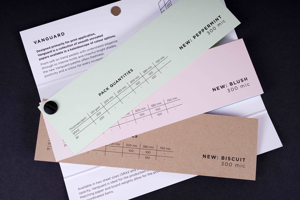
Designed primarily for print application, Vanguard is a collection of smooth uncoated papers available in a kaleidoscope of colour options. Extensive market research and the evident growing demand for muted and relaxed shades was the inspiration behind the three new colour choices: peppermint, blush and biscuit.
The Vanguard peppermint colour epitomises a feeling of spring and cheerful energy, bringing a cool touch of personality to designs, while the Vanguard biscuit shade offers a warm, natural tone connected to nature. Lastly, blush is a soft pale pink hue capturing a neutral contemporary look, reminiscent of pale peonies and roses and the graceful swirl of a morning sunrise. The new Vanguard palette of 28 colours offers customers soft on-trend pastels with understated elegance, through to intense bolds and cheerful bright shades.
Aligning to James Cropper’s commitment to circular design, and the consumer’s continued need for environmentally friendly packaging, every colour in the Vanguard collection contains a minimum of 30% upcycled fibre, to keep materials in use and help in the regeneration of natural systems. The upcycled fibre, which is given a second life as a new paper product, is blended with fresh fibre from sustainable forestry sources to deliver beautiful papers without any compromise on performance or beauty. In addition to the three new colours, we have has also introduced new sheet sizes with the UK and European markets in mind. The portfolio of coloured papers is now available in two sheet sizes: SRA2 and B1, the most commonly selected print grade sizes.
The Vanguard collection is a snapshot of James Cropper’s colour and fibre capabilities. We believe the three new palette choices offer the freshness and positivity which the world is craving today; and the blend of upcycled and virgin fibre contributes to the circular economy, while delivering the premium quality we are renowned for.
With the benefit of high opacity, Vanguard is ideal for the production of printed items such as letterheads and envelopes, posters and brochures, invitations and tags, presentation folders and business cards. Matching paper and board weights enables the production of coordinated items.


